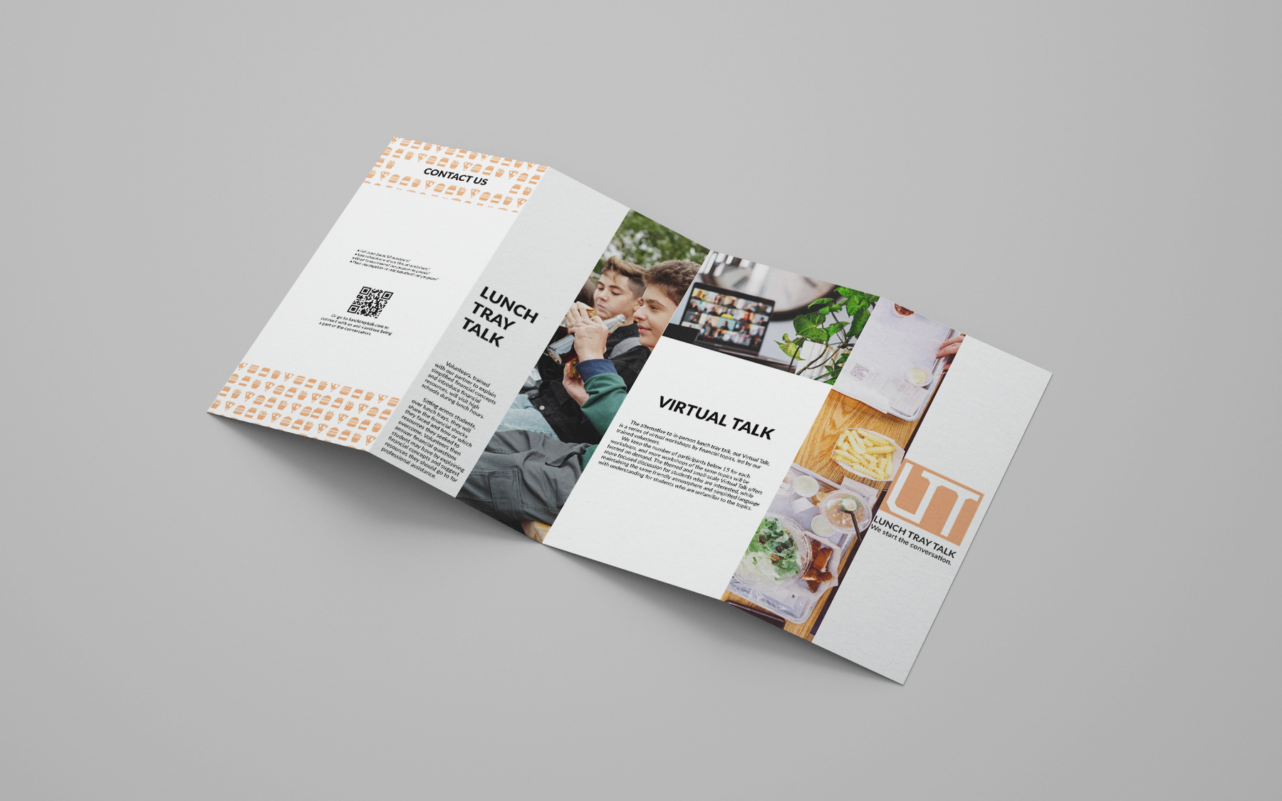
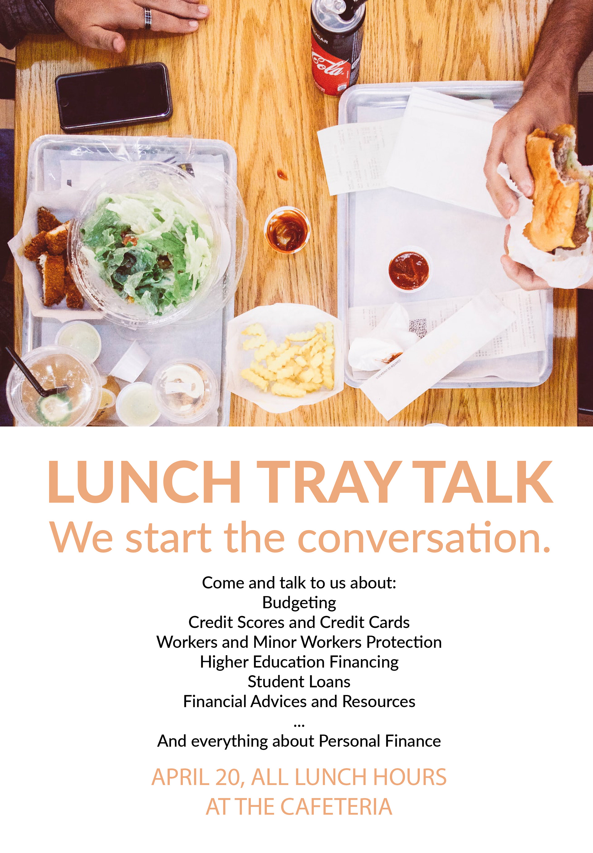
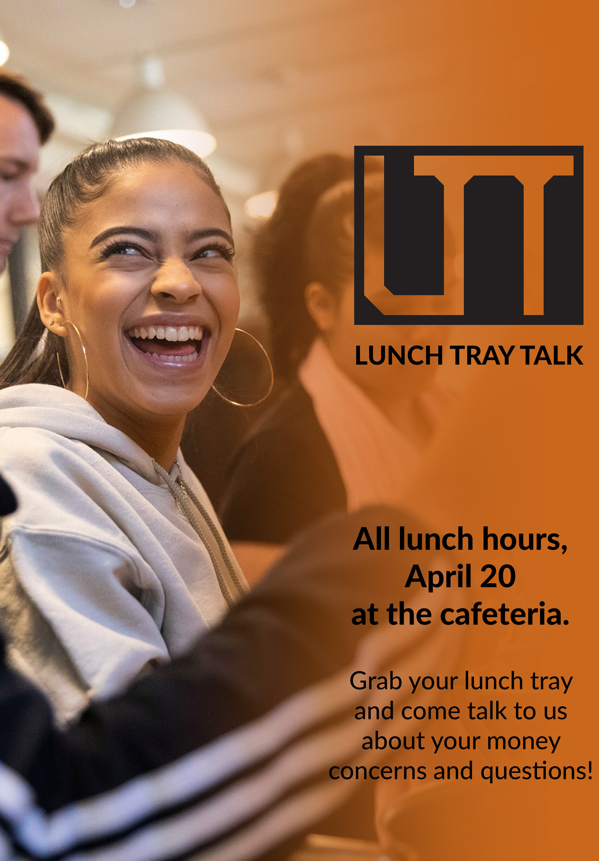
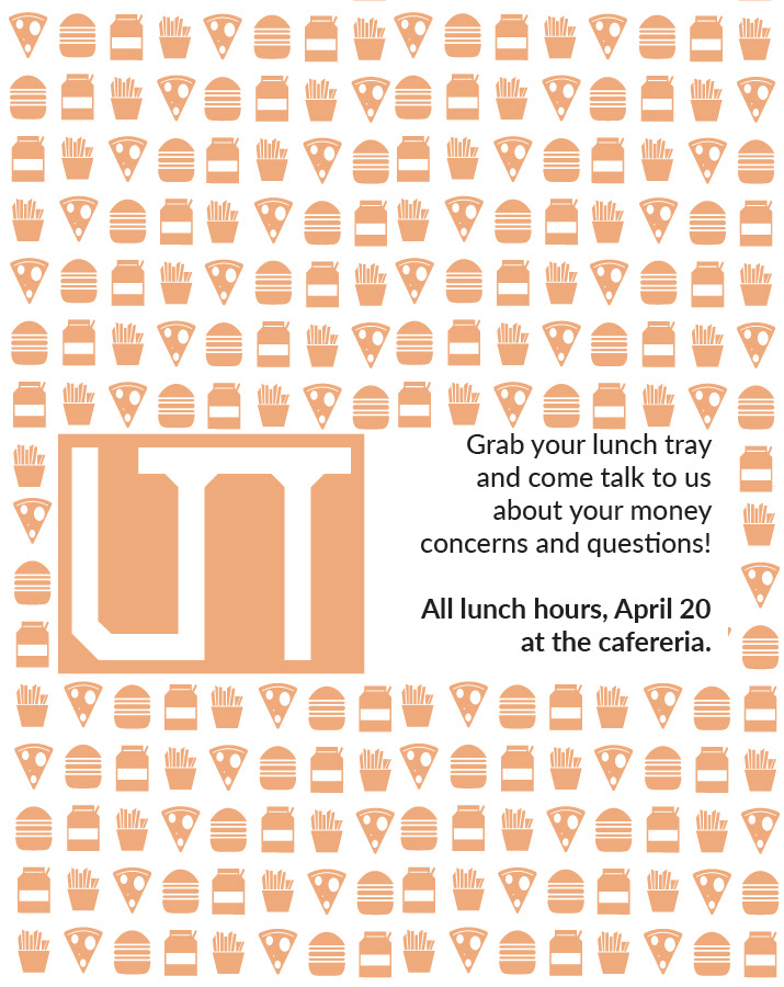
Lunch Tray Talk is a project that aims to connect trained young adult volunteers to high school students to share their experience with personal finance, answer basic questions, introduce financial resources and start the conversation to get high school students more open to talking and learning about personal finance.
The goal of this project is to connect high school students with young adults who are close in age and experienced with personal finance (higher education, taxes, moving out, entry-level jobs…), with casual and friendly atmosphere to make personal finance an easier topic to discuss, preparing them with confidence and financial literacy to make important financial decisions that they will face after graduation.
Seeking playful and energetic but minimal and less text-heavy design to align with teenagers and young adults as target audience as well as the program's goal of transforming the typically intimidating topic of finance, I developed a promotional poster, a brochure for students to interact with during the action, and a website to keep the engagement going.


phase 1 - inspiration
The project started with secondary researches, during which I researched 5 research papers with topics ranging from effects of financial literacy to student loans to development of financial literacy since childhood. I then interviewed Robert Farrington, founder of student loans and young adult financial literacy blog-turned-multimedia-branch The College Investor, and a college student. I also conducted a survey among adults concerning their experience with financial literacy and personal finance education, as well as their level of confidence in personal finance.
Financial literacy has been proven based on secondary researches as beneficial and influential to managing budgets and taking out reasonable loans as well as crisis preparedness. Yet, interviews and survey show low level of financial literacy among American young adults due to lack of K-12 personal finance education. Some negative effects include inability to discuss finance and overwhelming student loan debts and stress..
phase 2 - ideation
I came up with around 40 ideas to help with the problem, and with consultation from professor and peers, ended up with the final choice being “older siblings lunch: young adults experienced with student loans, personal finance come to high schools during lunch to share about college financing, information or advice during lunch hours and answer questions.” The idea then got prototyped and put into user-test.


Prototyped brochure used for user test.
The user test result showed users thinking the program was open, inclusive and could ease students’ stress to talk to people close in age and know that they too were once clueless.
A major problem that occurred was that the prototyped version of the program relied strongly on students’ willingness to participate when the students themselves are oblivious. Solution was to include in the brochure a set of questions and sub-topics for students to get familiar and for the program to indirectly take the initiative in starting the conversation.
The second issue was that the contact information including multiple email addresses for different purposes are too complicated. This prompted a need for either a website or social media platform that enables all interaction and connection with the program in one place.
phase 3- implementation
The Implementation phase began with the branding of the program, especially the creation of logo. I start out sketching with 3 major concepts: a literal lunch tray, a hamburger that represents typical school lunch and a stylized LTT (abbreviation of Lunch Tray Talk).


Logo sketches
The final logo ended up being a stylized LTT within a lunch tray, as I found both ideas a bit too simple. I stuck to the original brownish orange (with a bit rendering for bolder shade) and white color scheme as it is bright and youthful but calm and modern.
While the burger did not make the cut as it would make a second symbol competing with the lunch tray in the name of the program, it inspired me to create a pattern of typical lunch items for decoration and consistency across deliverables.


Final logo (left) and decorative pattern (right)
Next, I updated my main deliverable which is a booklet and put it in a mockup.
Some changes from the prototyped booklet included the more cost-efficient and portable folded leaflet instead of large brochure, a set of questions and topics to start the conversation, a blank note section to keep students going back and engaging with the program after the meeting, a link and QR code to a website instead of several contact information for different purposes. Design-wise, I made the layout more spacious and add in the decorative pattern created earlier. For font, I chose the monospaced, sans-serif Lato font family, as it is clean, minimal and modern, aligning with the overall look I wanted for the designs.


Example pages from the leaflet.


Leaflet mockups
I continued by designing promotional poster for the program. I came up with 3 designs: one being more traditional, text-dominated; one being more professional-looking, with stock image of student smiling and short text; and the third being more playful and mysterious with the created pattern being the background. The third one became my final choice, as I felt it conveyed the necessary lightheartedness and playful minimalism that Gen Z generally enjoys.


The 3 poster designs, the right one being the final one.
The final deliverable, the website, started out with a simple diagram. Taking note of a recent reading about laws of UX and how human processes information better small chunks as well as learning from test users' frustration with too many contact information, I tried to make the structure as hierarchical and simple as possible. The website allowed everyone to learn about the program, volunteers to see on-location and virtual training schedule and sign-up / log-in, students to learn about both forms of our programs and sign-up for either a virtual workshop or for us to schedule a school visit. Visually, the website incorporated the program's theme color orange and images used for the brochure to stay consistent with other design deliverables.

Initial diagram of the website structure


Screenshots of the website


