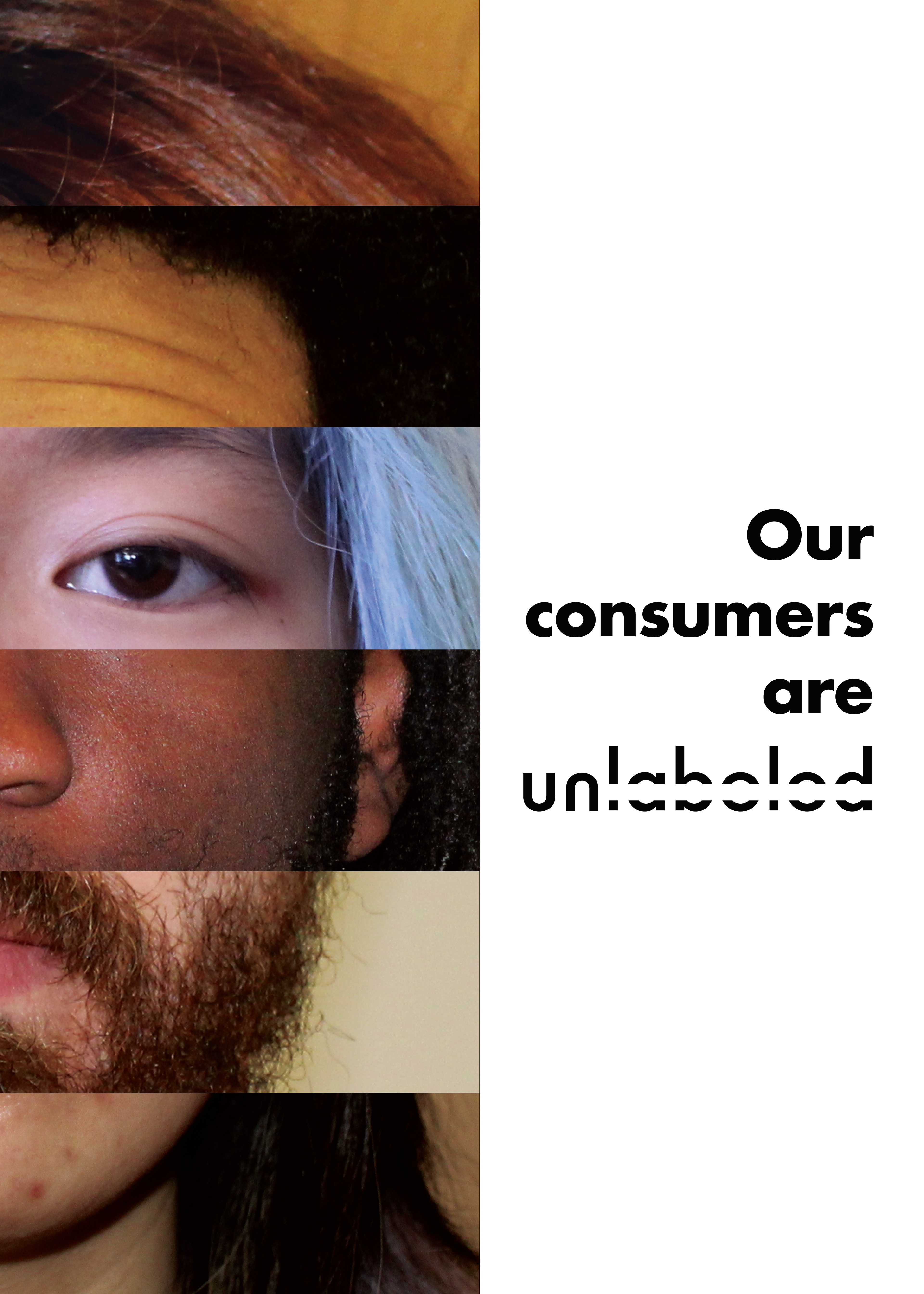
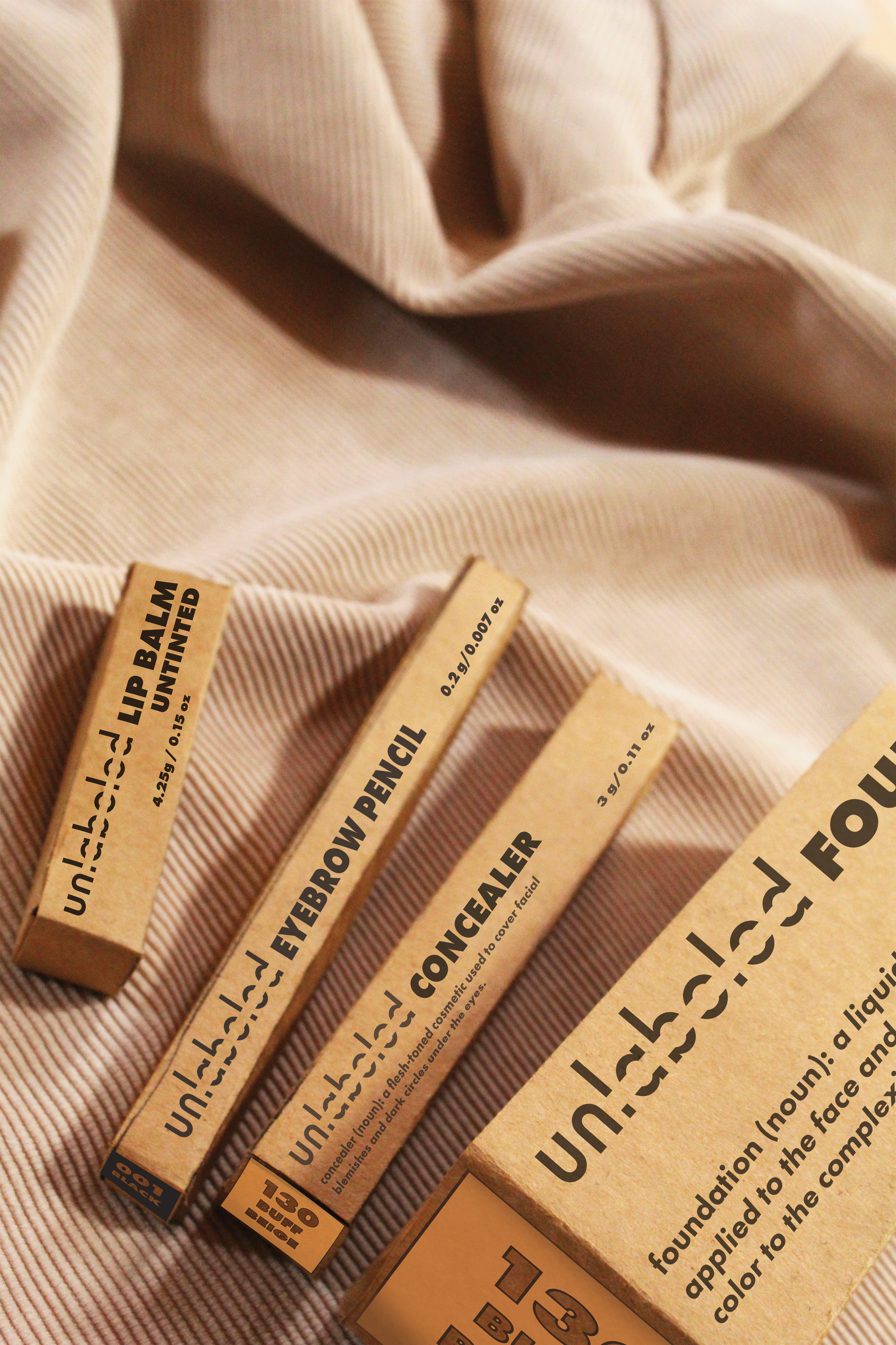
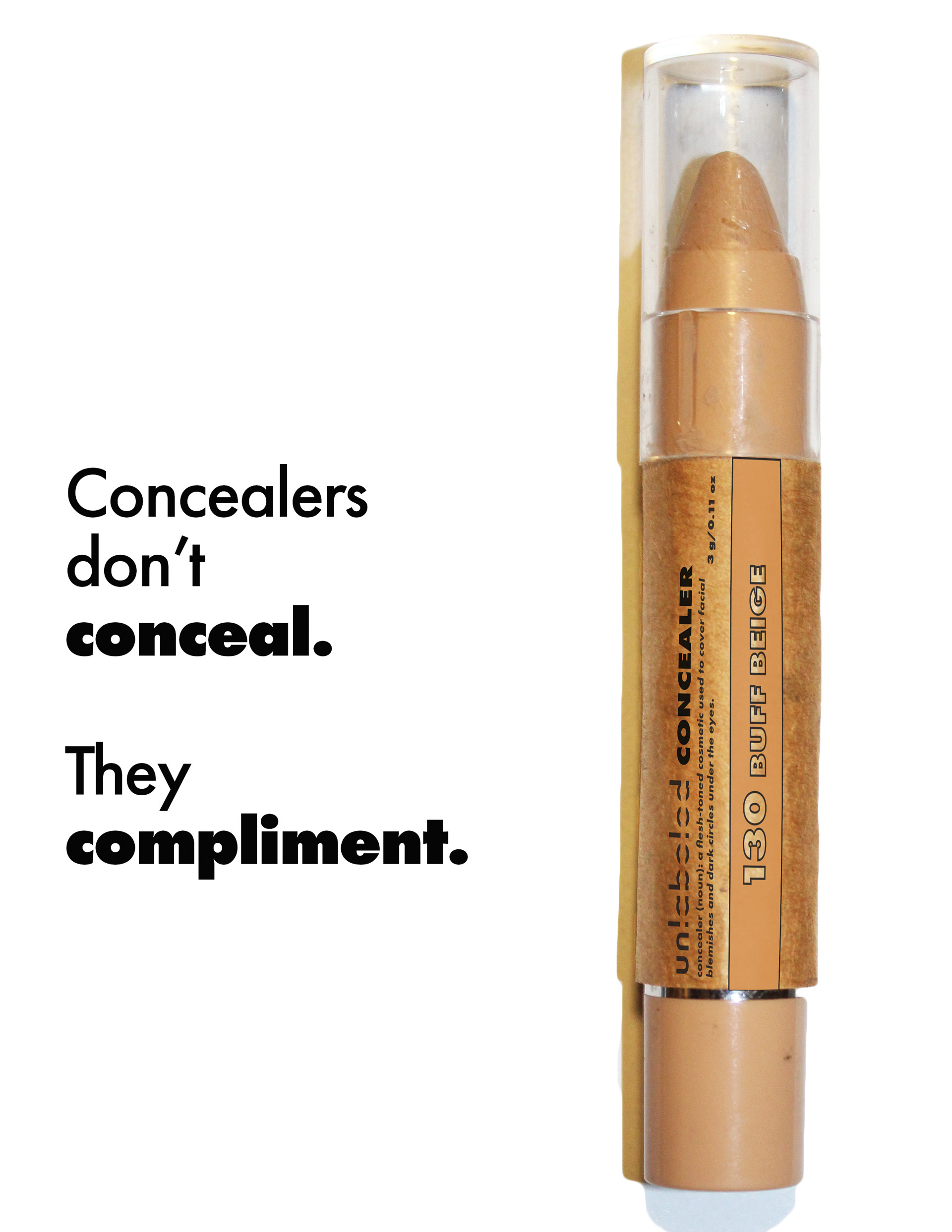
Completed as Thesis for Graphic Design at Oakland University, unlabeled is a makeup brand which aims for neutrality across gender identities, ages, races and level of familiarity to makeup. It offers essential makeup products with natural palettes, set out to cater all makeup needs, with stylized industrial packaging that is welcoming to all demographics.
The Cause
Being a KPOP fan for 14 years and having consistently witnessed male KPOP idols getting their masculinity compromised and gender expression labeled by their heavy makeup use, I have been concerned with inclusive makeup branding and advertising for many years. 
Seeing most inclusive makeup brands choosing either "medical minimalism" aesthetic that is heavily high-end/corporate or funky color pops that is very trendy but exclusive to younger consumers, subconsciously portraying inclusive makeup as an upperclass progressive realm, I seek to explore a friendlier, drug-store and all neutral makeup brand.
The Logos
The brand started with the name "unlabeled". To unlabel means to remove stereotypes from non-traditional makeup users and welcome all demographics as our target consumers. For the main logo, I experimented with different kind of wordplay on "unlabeled" on sans-serif, monospaced fonts; eventually settling with Futura, a flipped "u" in replacement of an "n" for symmetrical design, an "unlabeled"/crossed-out latter part of the text, and an "un" label lettermark as secondary logo.
The Packages
I next got to packaging design, which was the first time I challenged myself with. I wanted to go for a minimal but casual look; and decided on choosing a texturized packaging material - Kraft paper which is both casual (traditionally used in industrial packaging) and intricate (recently commonly used in DIY as well as handmade packaging) - to subtly soften the clean, minimal design instead of adding a lot of illustrative elements. The definition of the product was made a kind of tagline - it suggests that the makeup does simple things that don't compromise consumers' gender expression or age, as well as aligns with the brand's goal of being basic and friendly to new makeup users.
The Product Photos
For the mockup, unable to find suitable available mockups, I contemplated creating my own mockups with Adobe Dimension as well as creating physical mockups myself. While Adobe Dimension worked great at first, I realized that I couldn't master this new program quick enough for the complicated, lifestyle product photos that I wanted. I ended up gathering materials and made my own product mockups, again challenging myself for the first time with product photography. I tried lifestyle, flat lay, straight-up, group shot, individual shot..., resulting in nearly 150 photos in total, only to pick out around 5-7 photos to mock-up for final poster as well as catalog.
The Posters
The campaign posters were made based on two taglines: "Our consumers are unlabeled" (which conveys our goal for inclusivity and neutrality) and "Concealers don't conceal. They compliment." (which addresses the stigma against makeup use overall). The first poster was designed with a face collage made of portraits of a diverse group of people to subtly call for our target consumers without calling them out by their categories. The second poster was made much simpler with a clean cutout of our concealer next to the tagline. 
The Result
unlabeled is my own vision for inclusive makeup branding and advertising. While I am proud and hopeful about the project, it is not yet perfect and I would love to continue expanding on the idea as well as exploring other approaches to makeup branding and advertising that are welcoming to all demographics.

You may also like

Back to Top